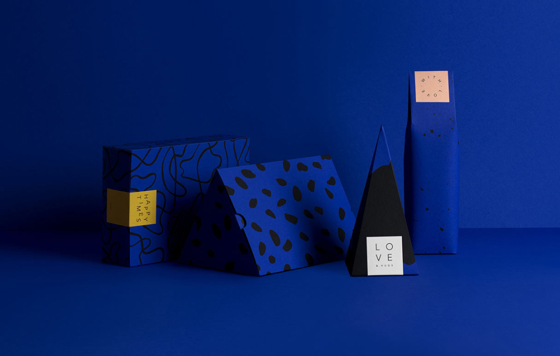

Design Principles
The strategies of behind design thinking
Balance
Balance refers to a relationship between two or more components on a vertical or horizontal axis. An axis can be created by lines, shapes, type or images.
You can identify symmetrical balance; creating an ordered and stable composition or asymmetrical balance; creating a vibrant, dynamic composition. Consider the purpose of VCin evaluating Balance.
Contrast
Contrast is the difference between two or more components of a visual communication. You can identify contrasts between shape, colour, line, type or other elements.
Figure-Ground/Distance
Figure-ground means the relationship between an image, shape or type (positive shape) and its opposite (background or negative shape).
Cropping
Cropping is enlarging and/ or cutting off a shape, type, image to emphasise it and attract attention. Cropped (or cut) images may take on an abstract quality. This makes them appear fresh.
Scale
Scale refers to the relative sizes of similar or same objects in visual communications. Using differently sized objects together helps create of depth in a composition.
Proportion
Proportion mean the ratio of relative dimensions of an image, shape or type. Compare the proportion of height, depth, width and/ or length of components. Designers also change the proportion (and scale) or components to fit differently proportioned ‘formats’.
Hierarchy
Hierarchy refers to the ‘reading order’ for visual communications. Hierarchy is created by size, colour, scale and contrast and position of components in a design.
Pattern
Pattern is a repetition and/ or alternation of a design component to create a visual unit. Patterns create texture and/or draw interest.
Design Elements
The building blocks of design
Colour
Colour communicates both optically, and emotionally.
Some classifications are: primary or secondary, warm and cool colours, and harmonious or complementary colours. These are tonal values that create depth.
Consider the symbolic meanings of colours and how they make us feel. Consider the role of colour in Hierarchy.
Shape
Shape refers to a two dimensional enclosure. Shape can be organic, natural or biomorphic shapes that remind us of nature. Geometric, rectilinear, sharp, hard edged or man-made shapes remind us of mechanical things.
Shapes express different emotions.
Line
Identify a kind of line. They can be organic or straight, natural geometric. They can also be light, thick, sensitive, textured, flowing, jiggered or regular. They can be make by a pen, brush or mechanical instrument.
Tone
Tone usually emphasises form. Tone creates subtle or dramatic effects. When we shade a drawing to make it look three dimensional we are applying tone.
Tone also describes both light direction and style of light. We can create a harsh or soft light in renderings.
Texture
Texture represents the surface. Identify texture as rough and smooth. We have real texture; that is texture that you would feel with your fingertips, and visual texture; like a lion’s coat in a photo.
Form
Identify forms such as a cube, a pyramid and a sphere. Form is created by design elements; shape, tone, line and point. In analysing visual communications we talk less about the role of form and more about the role of these other elements in creating form.
Point
Point is the mark in visual communication. Point is needed because it creates textures and tone and shade.
Point is also used to locate something. Colour and size emphasise information.
Type
Identify kind of typeface; Serif, Sans serif, decorative. Discuss type anatomy, type size, colour, case, alignment, typesetting adjustments; Leading, tracking, kerning.
Serif typefaces can = authority, experience, wisdom and tradition. Sans- serif typefaces = newness, freshness and objectivity. Decorative, hand generated or manipulated type = different emotional effects.
 Leave A Comment
You must be logged in to post a comment.


 Leave A Comment
A big thank you for your blog post. Really looking forward to read more. Really Cool.